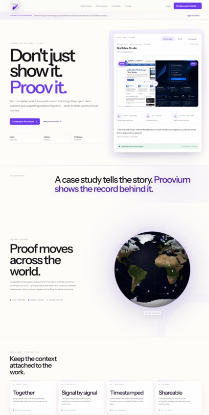

PROOVIUM
ABOUT PROJECT
A bespoke digital project shaped around the business, its buyers and the standard of work behind it.
TYPOGRAPHY
Typography sets the tone before a buyer reads a single sentence. For Proovium, the type system is kept direct, technical and highly legible — serious enough for commercial buyers without feeling corporate for the sake of it.
Used font:
Inter
PALETTE
Colour is used with restraint so the brand feels established and technical. The palette gives the interface contrast, hierarchy and a recognisable visual signature without competing with the project work.
#020304
rgb(2,3,4)
#14C8B4
rgb(20,200,180)
#F4F4F2
rgb(244,244,242)
RESULT